#shareyours
TypographyA typographic project applying a new brand standard to the radical generosity movement #GivingTuesday, consisting of a toolkit for nonprofits and a series of posters.
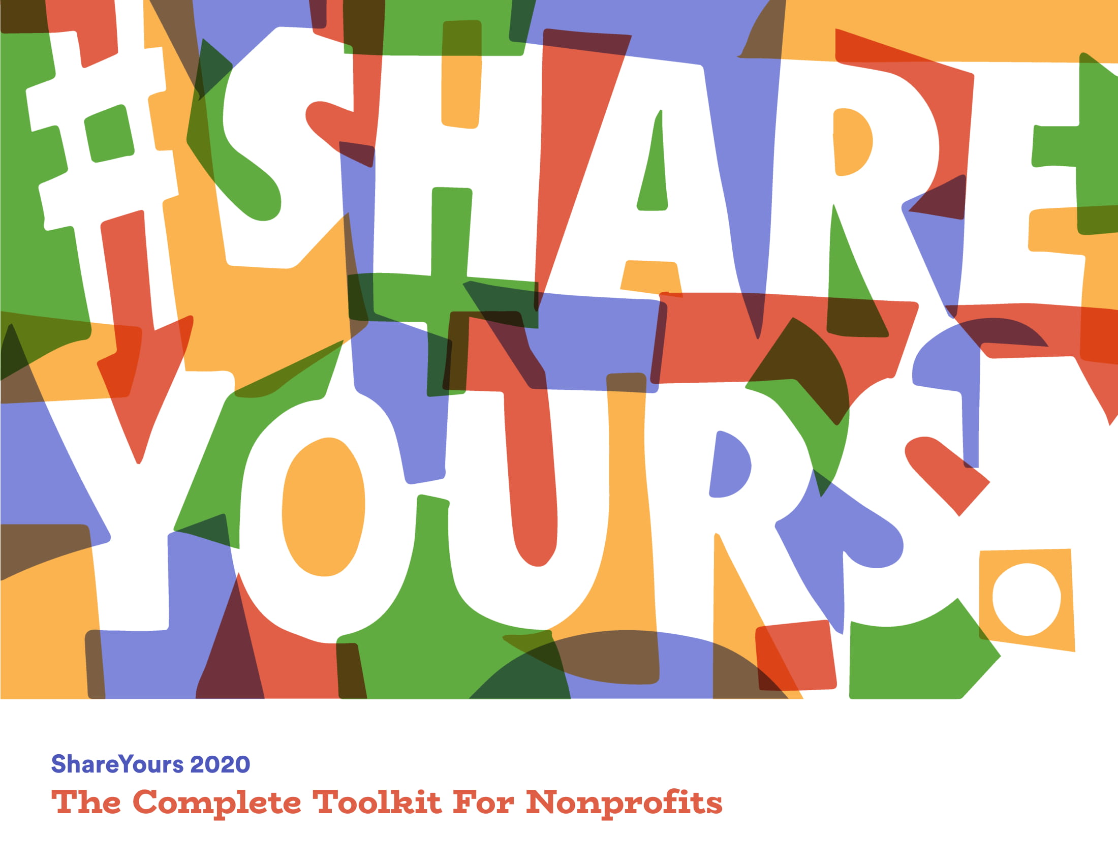 The illustration on the front of the toolkit document served as the basis for the toolkit content and posters. The concept was ‘little pieces coming together to form a bigger picture’, the very basis of the generosity campaign this project was based on.
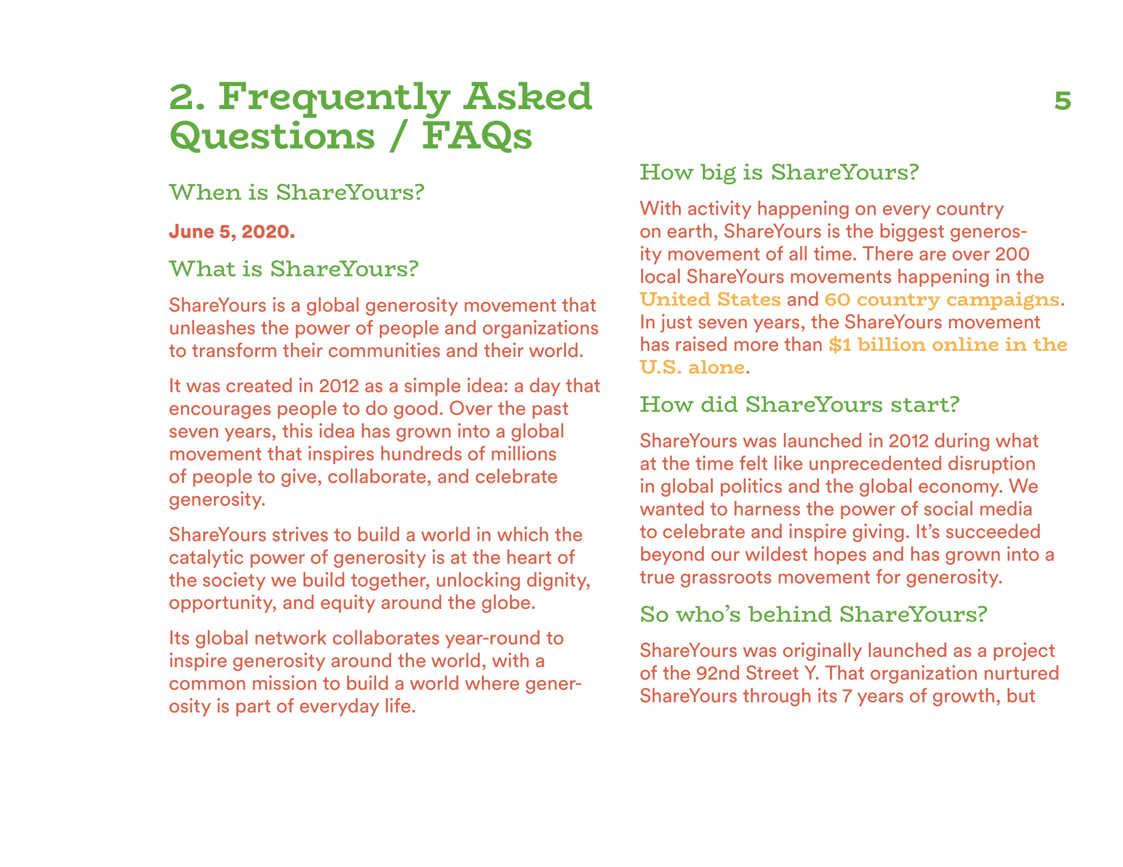
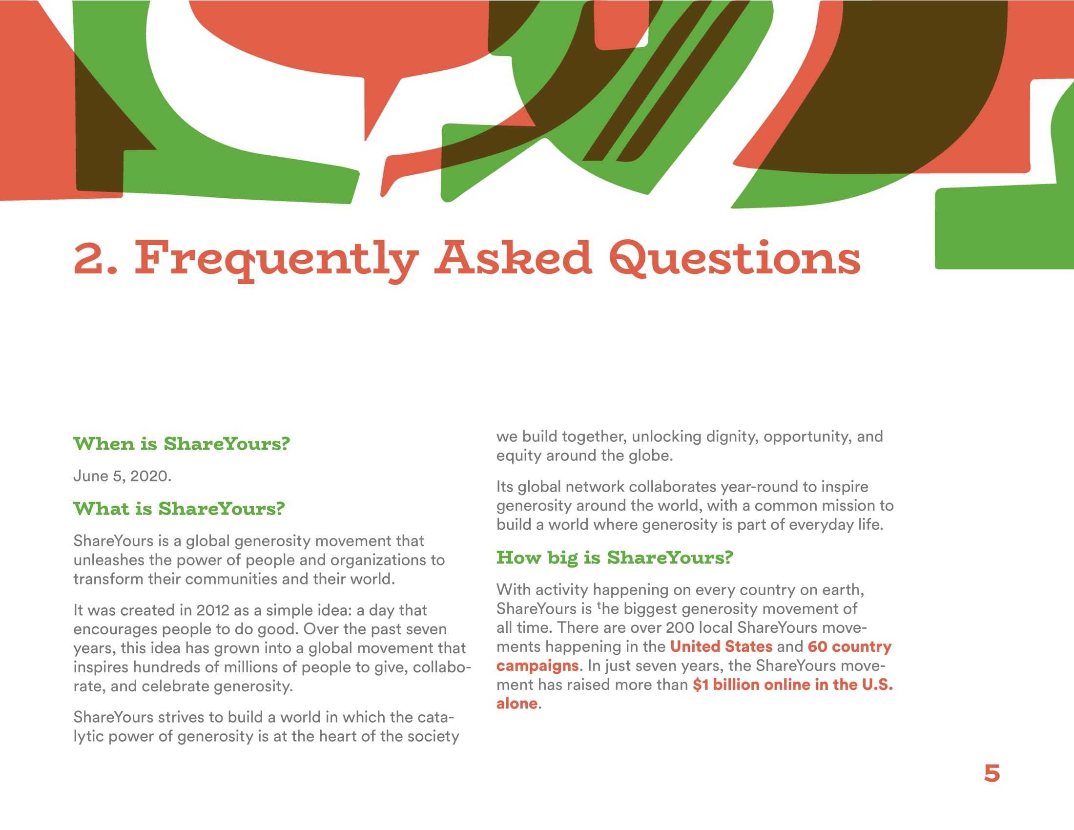
Comparison between earlier (left) and later drafts (right). Initially, I was putting body copy in several colors, but this approach was a little too frivolous for the purposes of the document. Regular copy was made smaller and in dark grey, while accents were kept in vibrant colors used for each chapter. Bulletpoints were also remade from the standard circles and dots to hand-drawn accents.

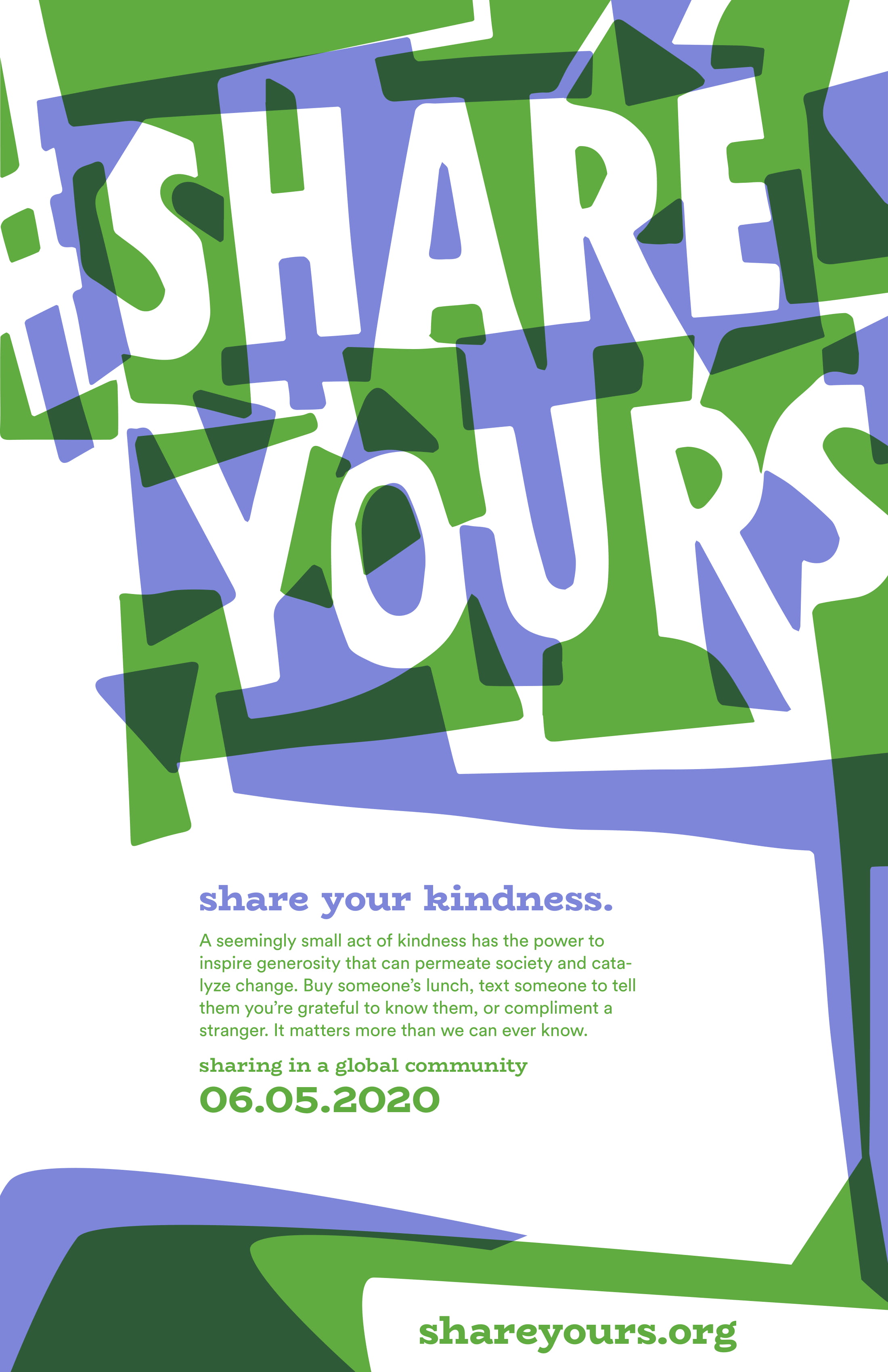

Poster designs. The initial approach I took for the toolkit was applied here instead.