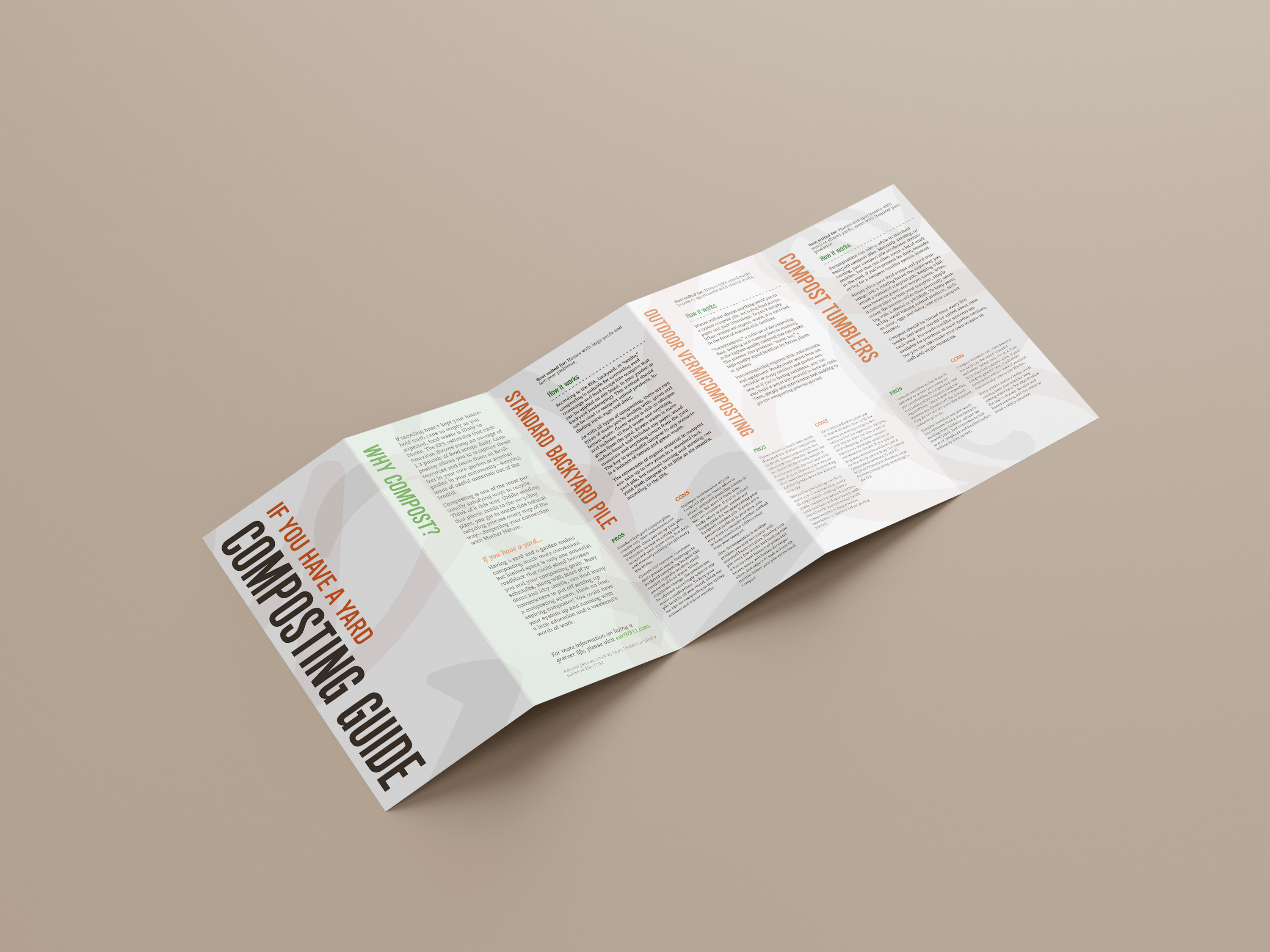
Guides to Composting
TypographyA typography project consisting of an informational poster and a double-sided pamphlet on methods of composting. The biggest limitation to this project was that I could only use typographic forms to create any kind of imagery in these works, so I opted to recreate the organic components of compost using the curving shapes of italic glyphs.
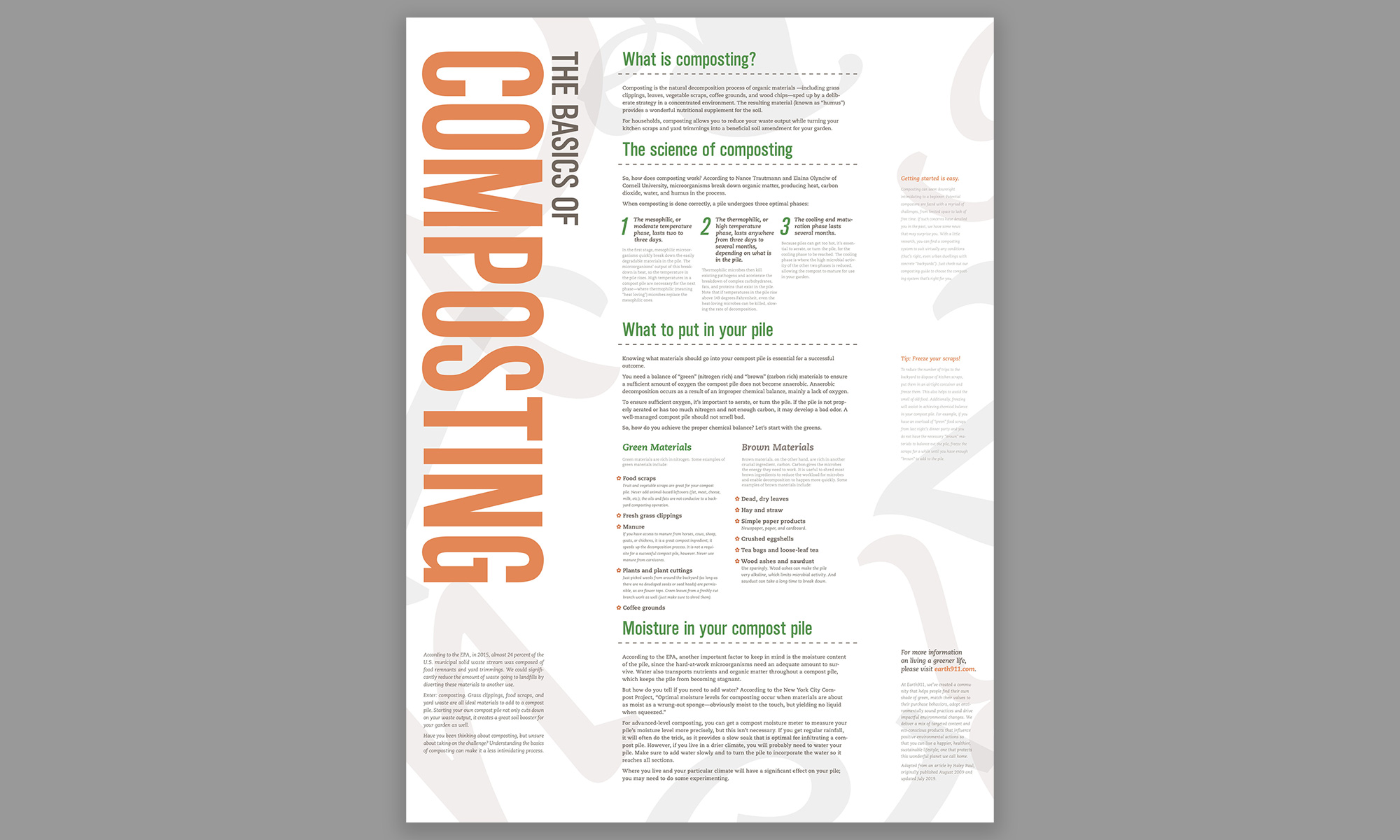
The final poster and leaflet. Initially, I wanted to use a dark vertical segment on the side of the media to evoke the image of compost - this was changed in favor of applying organic forms across the whole page, but the color block returned as a vertical text column.
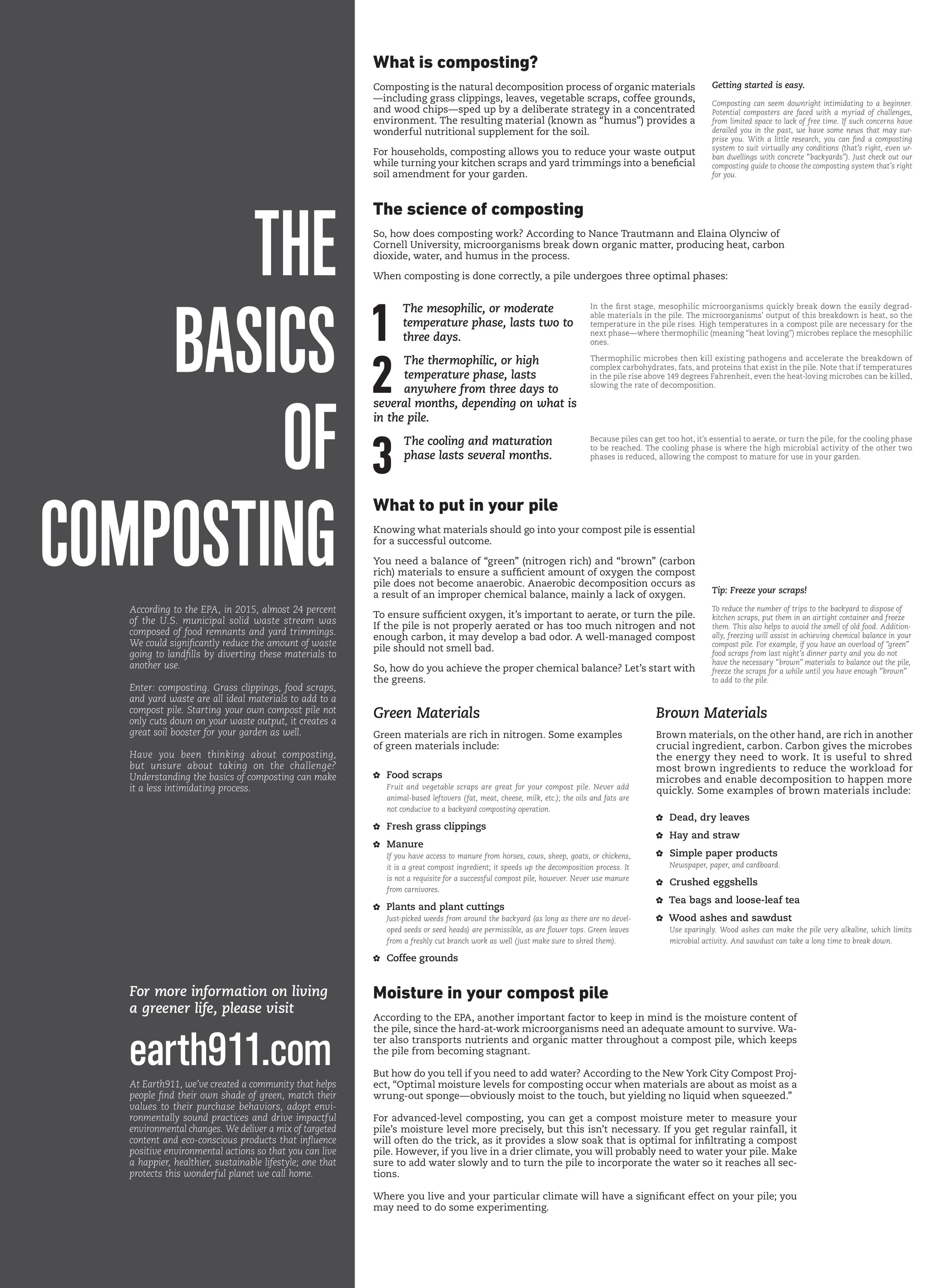
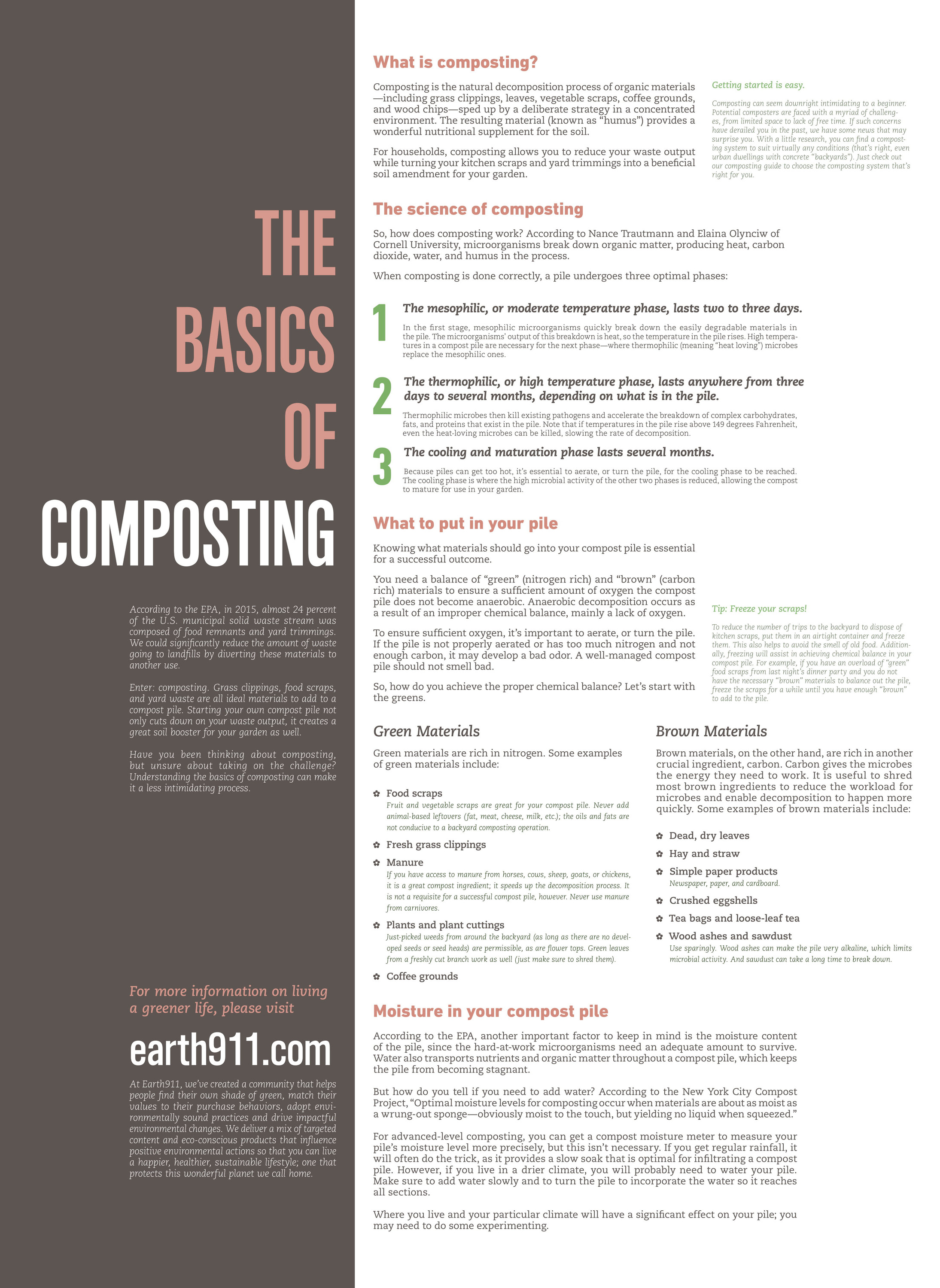
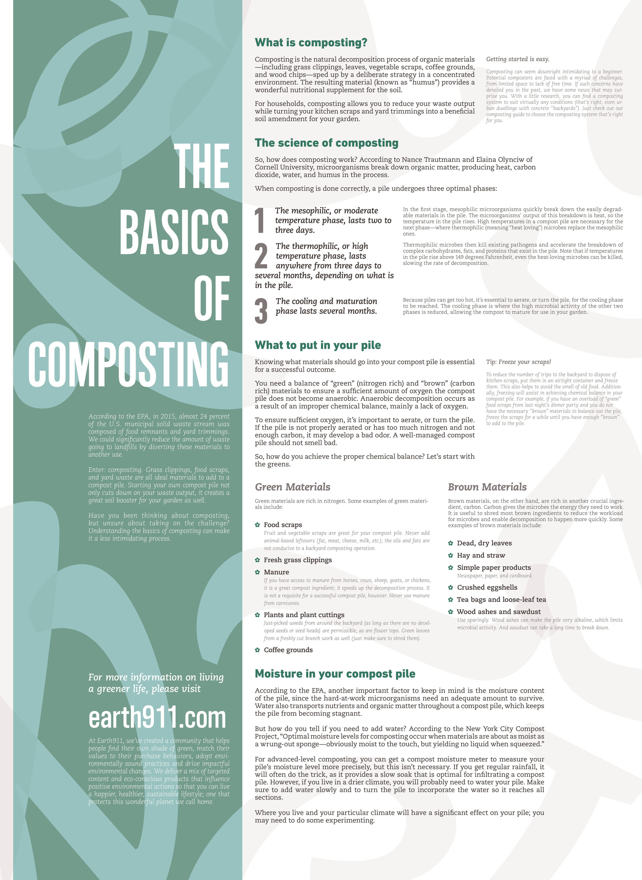
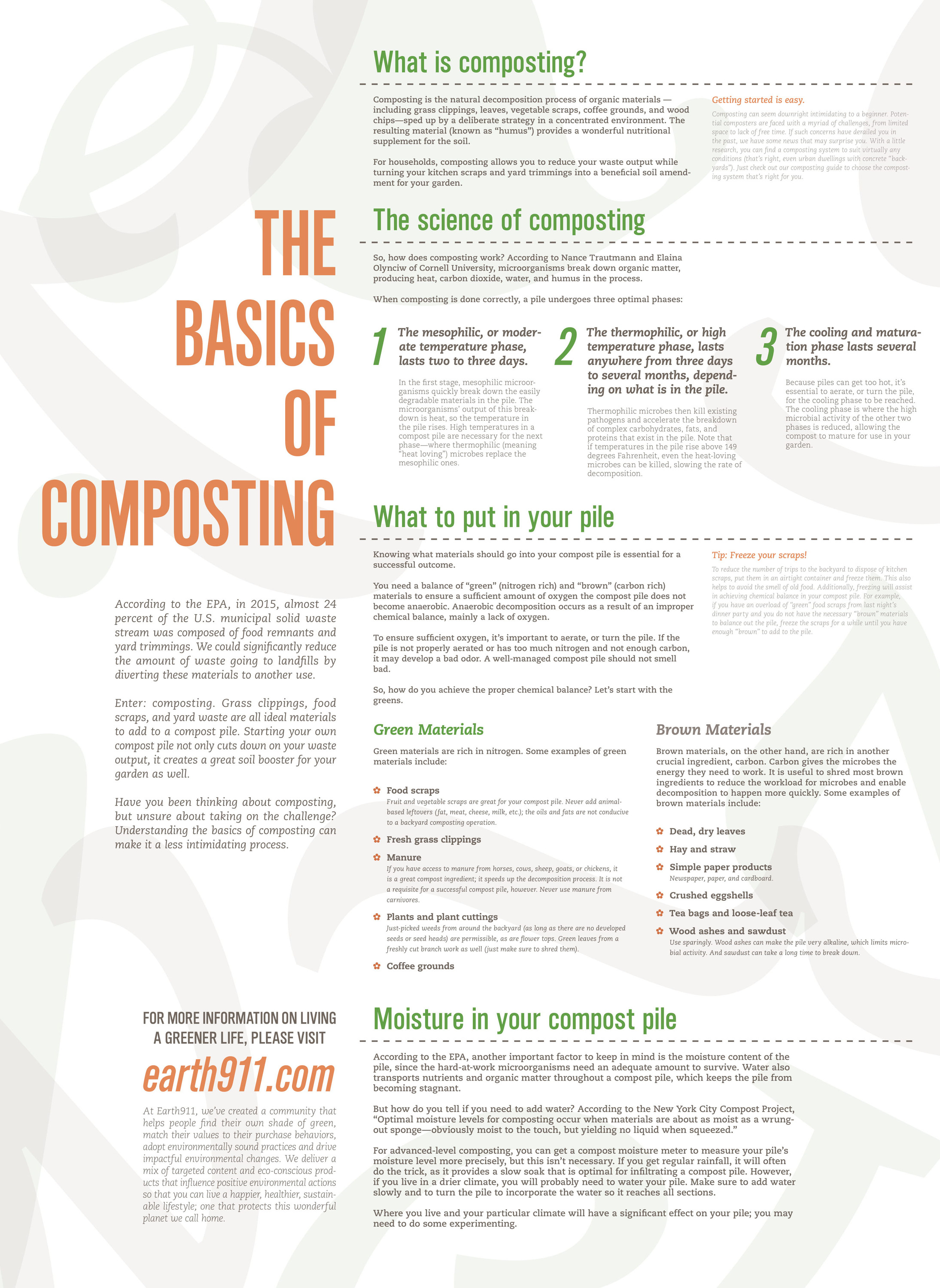
Poster drafts. Initial iterations were divided into a title section on the left and content on the right. Doing away with it made the overall composition much lighter.
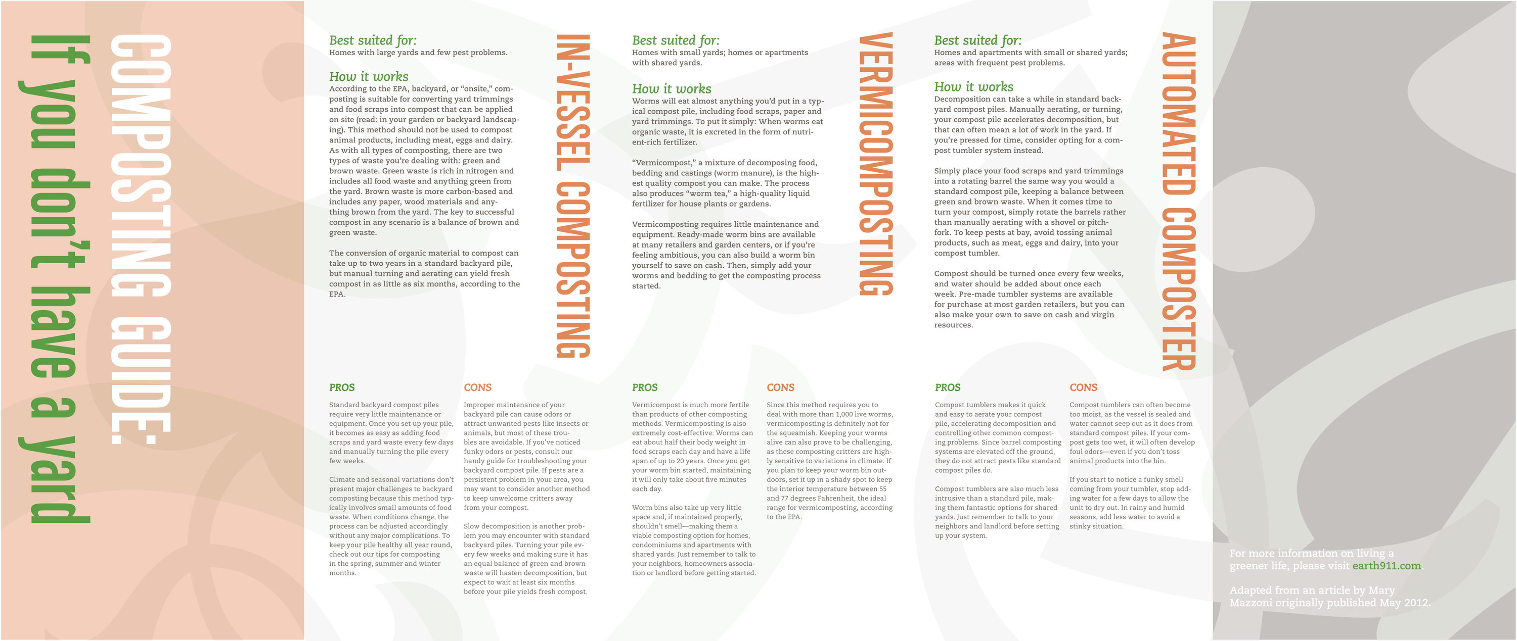
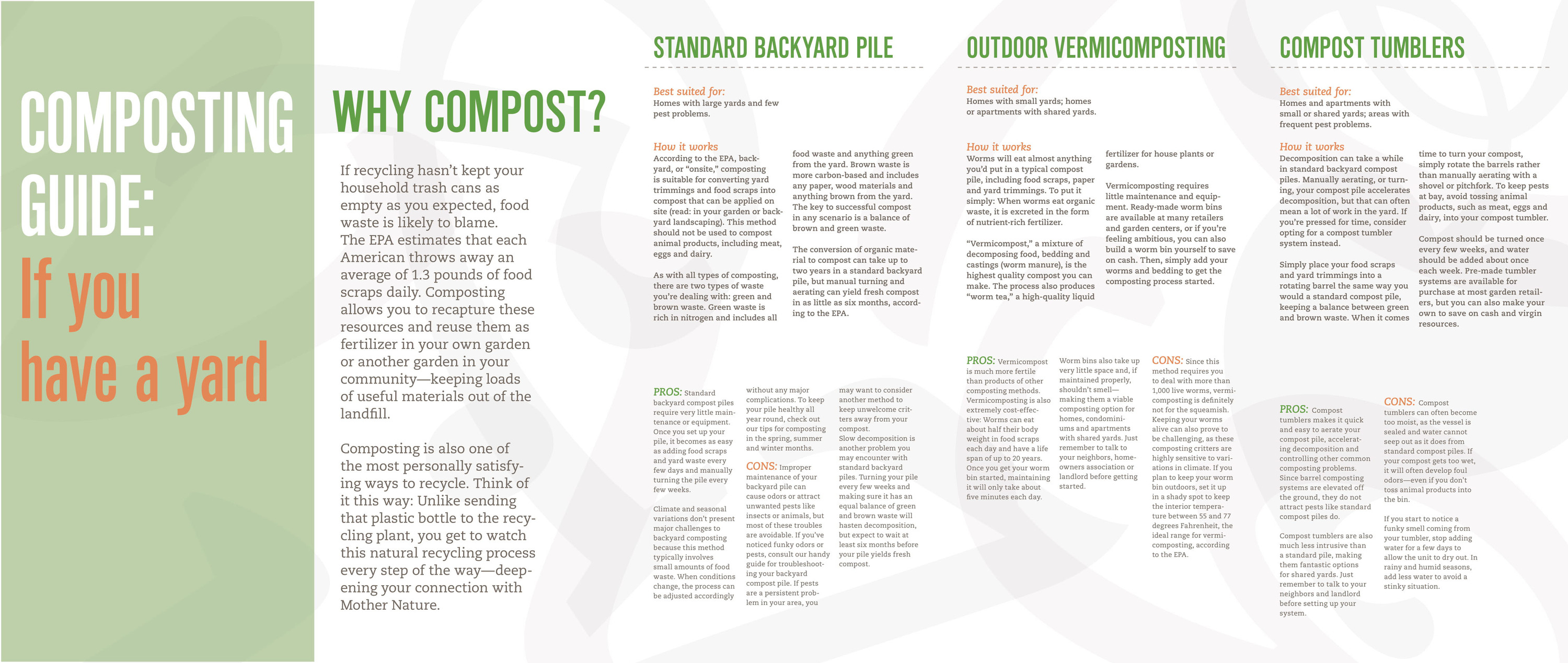
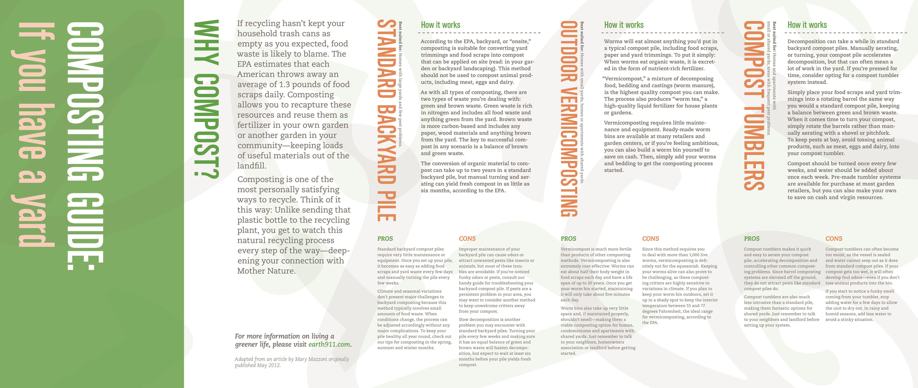
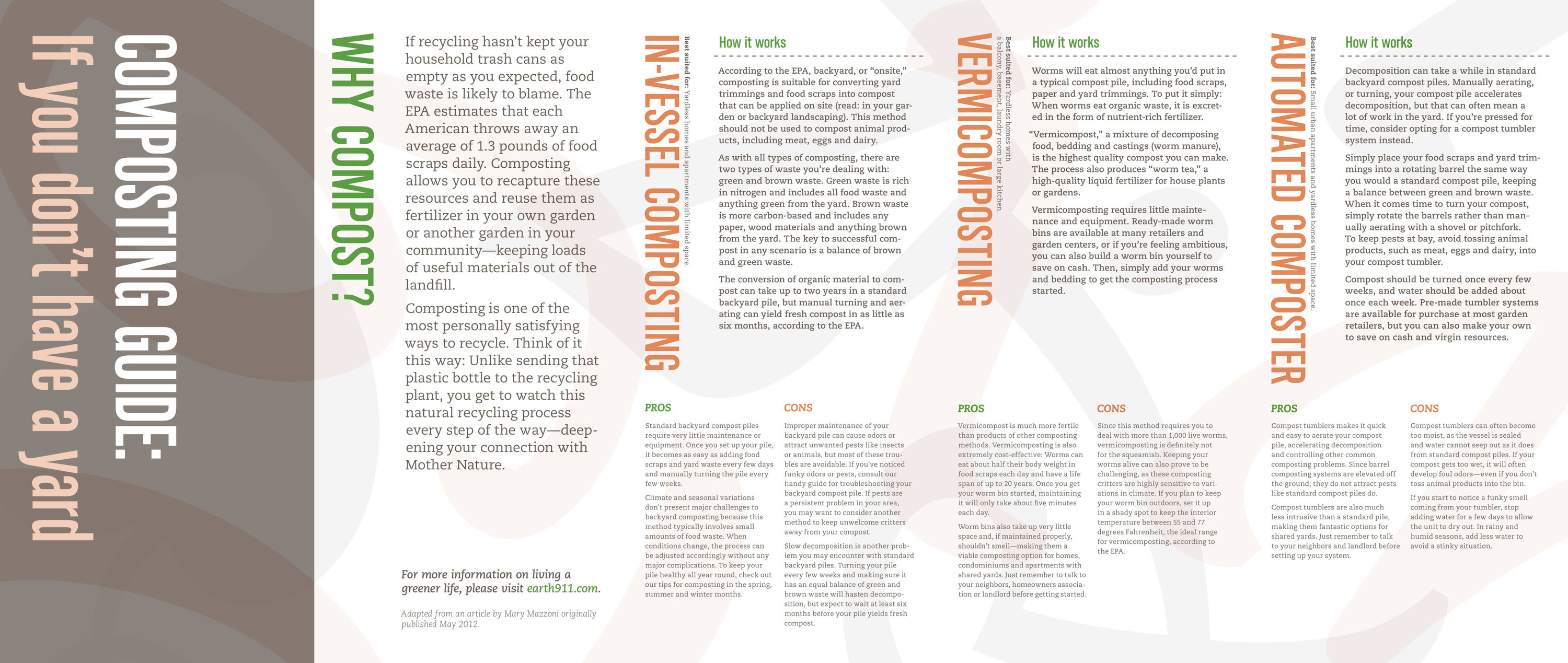
Initial pamphlet drafts. These were designed based on the completed poster. Since this was a smaller piece of media with segments, I brought back the vertical color block, though it was very subtle in the final draft.