Economy of Means: The Changing Face of Typographic Design
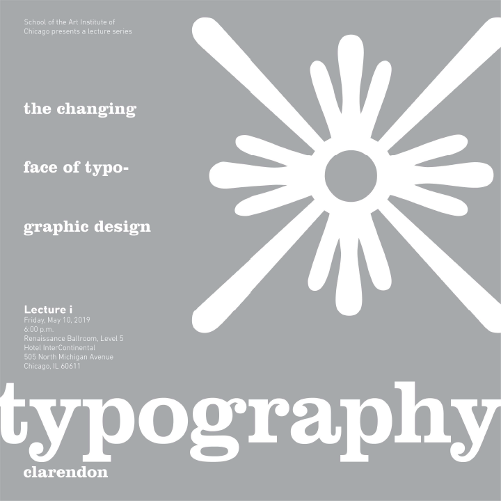
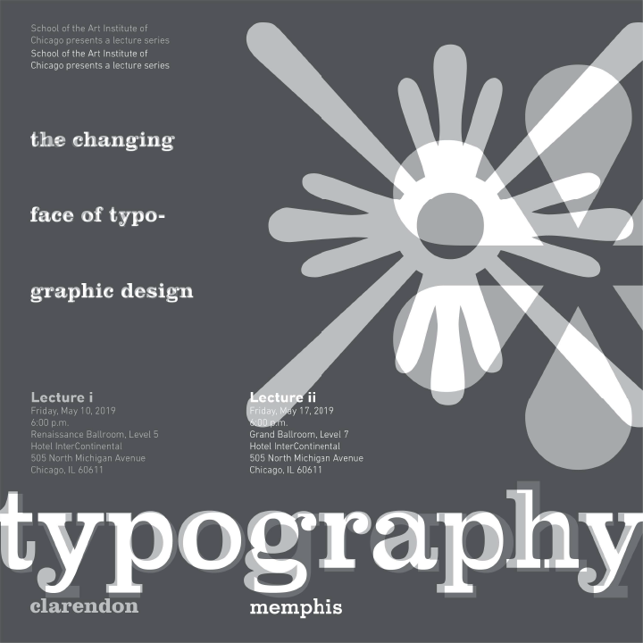
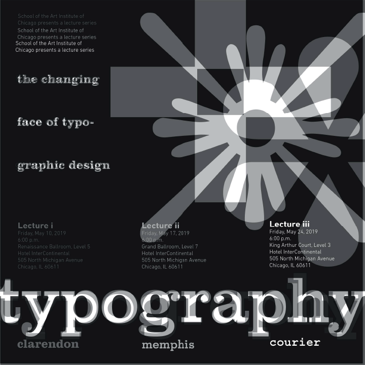
Typography
Lorem ipsum dolor sit amet, consectetur adipiscing elit. Maecenas in tortor risus. Praesent rhoncus neque a nulla volutpat, sit amet molestie nisi luctus. Vivamus sit amet pellentesque tortor. Maecenas quis egestas urna. Morbi volutpat risus in lacinia volutpat. Nulla placerat faucibus erat ac tempor. Praesent et urna at arcu viverra vulputate eget hendrerit odio.


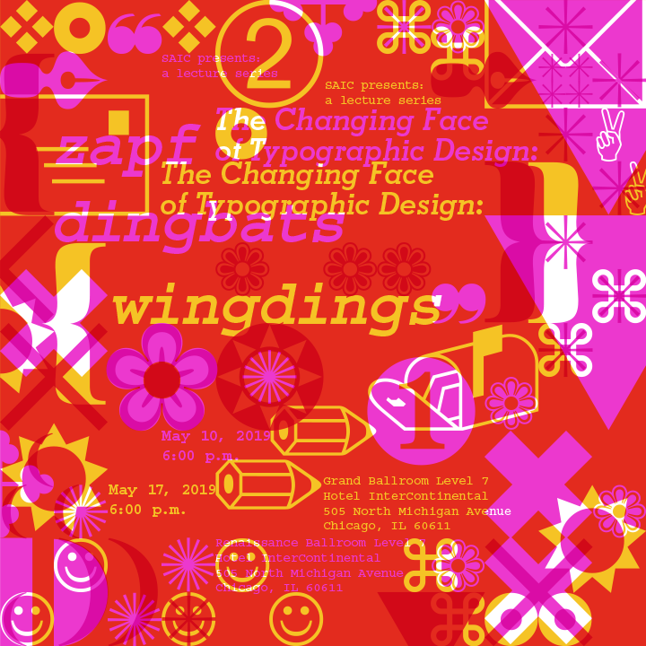

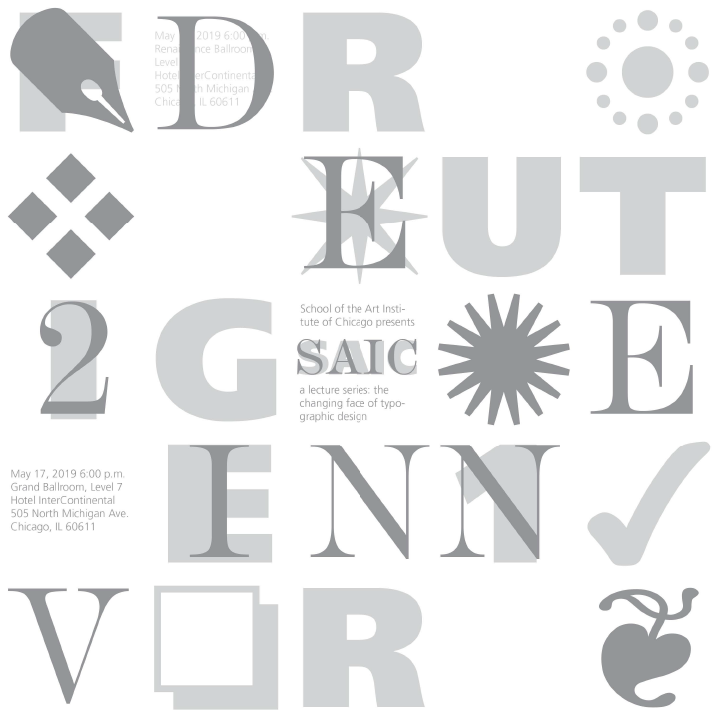
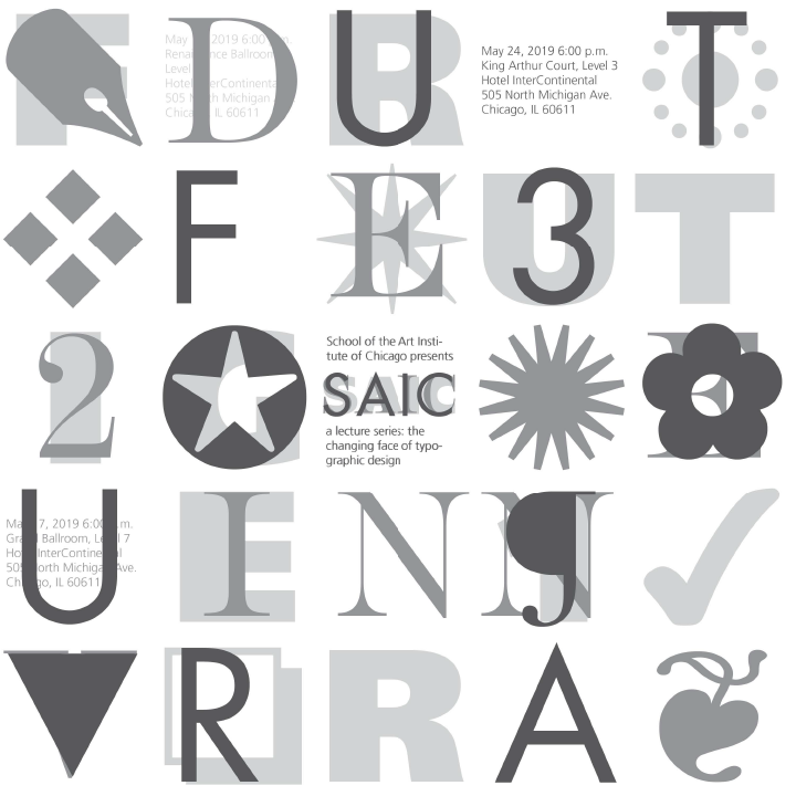
I took a bold approach to presentation by crowding each poster with glyphs that represent each typeface on a 12x12 grid. Although the explosion of glyphs makes each poster very visually busy, the important text elements - title, date, location, etc. - are placed along a linear diagonal path, implying progression (of time) between each lecture.
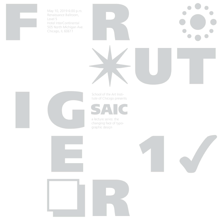
Rough sketches. Initially, I was going to choose typefaces with regular latin alphabet glyphs, but ultimately I decided to make the whimsical and graphic dingbat faces my focus for this project.
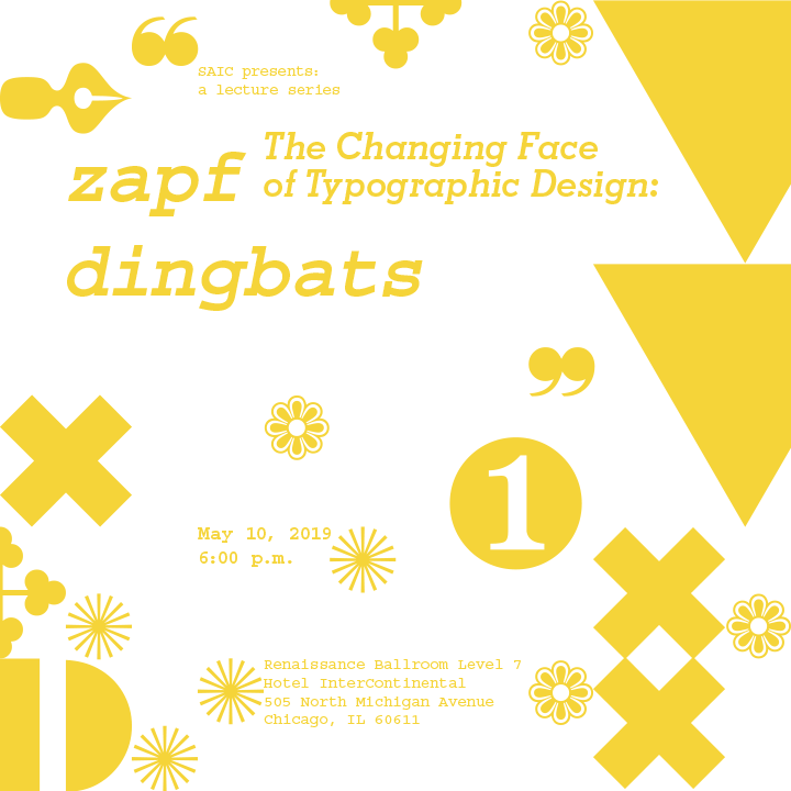
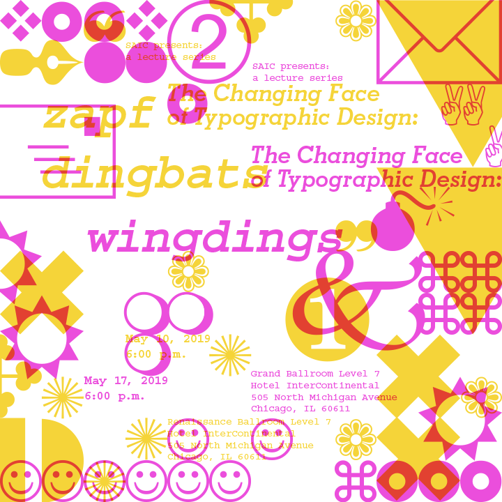
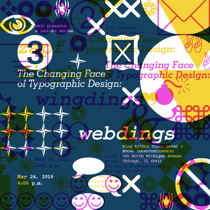
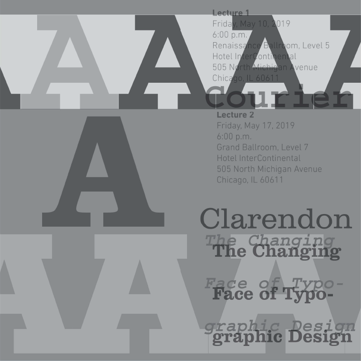
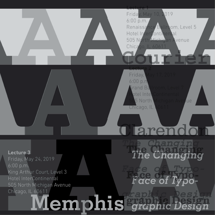
Initial draft. The color distribution across posters was not very consistent at first, so the final posters got the ‘white text over color’ treatment that layer 3 had, and the first poster got another layer applied over it in pink to soften the impact of transition between posters.